There is no fixed dashboard to outgrow. You define the reports; the platform compiles them to SQL.
Definitions, not screens
Most analytics products ship a dashboard and hope it fits. Infralytiqs ships a report builder instead. A report is a definition — some metrics, some dimensions, some filters, a time range and a visualisation — and the query API compiles it into one aggregate SQL statement against your table.
That means the interesting question is not which reports do you get, but what can you express. Below is the whole vocabulary: fourteen panel types, seven aggregations, and a dimension catalogue that grows with your own custom keys. The charts on this page are live renderings of those panel types, drawn from sample data rather than anyone's production traffic.
The vocabulary
What the report builder gives you before you have written a line of SQL.
📊
0
Visualisation types
Line, area, bar, pie, donut, gauge, table, number, map heatmap, counter, two realtime panels and two DAM quota bars
🧮
0
Aggregations
Count, unique, sum, average, min, max and latest value
🏷
0
Standard dimensions
Plus every custom key discovered in your own data
📅
0
Time range presets
Last 1 hour through This year, or an explicit window
The fourteen panel types
Pick one per report. The same query can be re-pointed at a different visualisation without touching its definition.
📈
Line and area
A metric bucketed over time, optionally with several series. Area charts stack to show composition; both support smooth or stepped curves.
📊
Bar
Comparison across a dimension, or a time series where discrete buckets read better than a line — daily active users, for example.
🥧
Pie and donut
Share of a total across a small dimension. The donut variant puts the headline figure in the middle, which is usually what someone is looking for.
◐
Gauge
A single value against a target — ingest success rate, quota consumption, an SLA. Rendered as a radial bar.
▦
Table
Server-paginated rows with sortable columns, for when the answer is a list rather than a shape. Row clicks feed drill-down reports.
①
Single number
One metric, large. The counter tile variant sits in the dashboard toolbar so a headline figure stays visible while you scroll.
🗺
Map heatmap
Event density on a Google Maps canvas overlay, from either GeoIP country resolution or opt-in precise coordinates.
📡
Realtime line and bar
Live user counts bucketed by the second, refreshing in place, with per-bucket drill-down into exactly who is active.
💾
DAM storage quota bars
Two AEM-specific panels: a quota bar for one folder, and a stacked variant comparing folders. Fed by scheduled snapshots from the AEM integration.
The panel types, rendered
Each of these is the same component the console uses, with sample data in place of anyone's traffic.
A metric over time
Line · Area
Two metrics from one query, bucketed by day. In the console, changing granularity to hour re-buckets the same definition without editing it.
Comparison across a dimension
Bar
count grouped by device_type. The console maps raw values to friendly labels, so smart_tv reads as Smart TV.
Share of a total
Donut
The same device_type grouping as a share. The centre carries the figure someone actually came to read.
A ranked list
Table
Grouped by page_path, which is an ALIAS column computed as path(page_url) — so grouping by path costs no extra storage. Rows drill through.
DAM storage by folder
Quota bar
The AEM-specific panel, fed by scheduled asset_disk_usage_report events. Quotas are set per folder in the report definition.
One value against a target
Gauge
Accepted events over total received. Rejections are almost always malformed payloads, and the table panel beside it lists them individually.
The dimension catalogue
Grouped exactly as the report builder groups them. Anything not on this list lives in your custom maps, and the builder discovers those from your own data.
Group
Dimension
Column
Typical use
Identity
User ID
user_id
Your own identifier, once someone is known
Identity
Anonymous ID
anonymous_id
First-party visitor identity; the usual basis for unique visitors
Identity
Session ID
session_id
Session counts and per-visit funnels
Event
Event Type
event_type
The primary grouping for almost every report
Event
Event Subtype
event_subtype
A second level, e.g. success or failure of the same action
Event
Event ID
event_id
Unique per row, so counting it counts events exactly
Time
Event Time
event_time
Millisecond precision; bucketed by minute, hour, day, week or month
Time
Event Date
event_date
The partition key — the cheapest possible date filter
Page
Page URL
page_url
The full URL including query string
Page
Page Path
page_path
An ALIAS of path(page_url), for grouping without the query string
Page
Asset ID
asset_id
MATERIALIZED from custom dimensions; the backbone of DAM reporting
Page
Search Term
search_term
MATERIALIZED from custom dimensions; what people looked for
Device
Country
country_code
Resolved server-side by GeoIP, so it works without client cooperation
Device
Device Type
device_type
Desktop, mobile, tablet, bot, smart TV
Device
Device OS
device_os
iOS, Android, macOS, Windows and the rest
Device
Language
language_iso_code
Locale targeting and content coverage
Marketing
UTM Source
utm_source
Campaign attribution
Custom
Your own keys
custom_dimensions[…] · custom_metrics[…]
Discovered from your data by the metadata endpoint and offered alongside the above
What a report definition looks like
This is the JSON the console stores and the query API compiles. You can author it in the builder or POST it directly.
{
  "name": "Unique Users",
  "mode": "toolbar",
  "query": {
    "metrics": [
      { "agg": "uniqExact", "field": "user_id", "label": "Unique Users" }
    ],
    "dimensions": [],
    "timeRange": { "preset": "last_30_days" }
  },
  "visualizations": [{ "type": "counter" }]
}

// Toolbar reports render as counter tiles pinned above the dashboard
// grid, so the headline number stays visible while you scroll.
// A realtime panel is the same shape with "type": "realtime".
The console
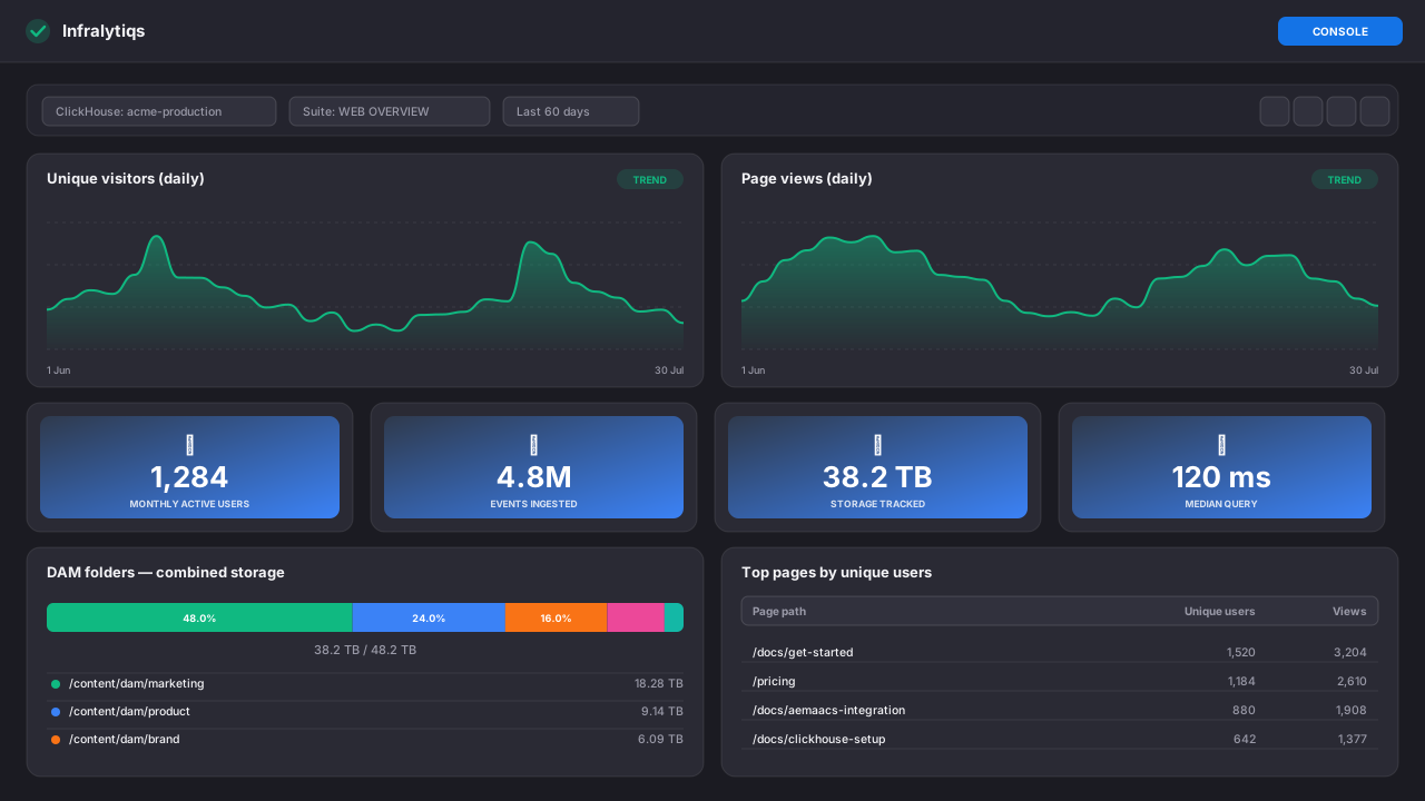
Report suites on the left, panels in a grid, and a time range that applies to everything at once.
console.infralytiqs.com/#/infralytiqs/reports
Console
Reports overview
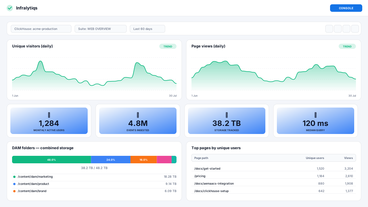
A report suite rendered as a dashboard. Counter tiles sit in the toolbar, drill-down reports stay hidden until you click into them, and the whole view follows the console theme.
Working with reports day to day
The parts of the console that are not a chart.
📦
Report suites
Reports are grouped into suites, and each suite belongs to a ClickHouse configuration. Mark one as the default and it becomes the landing dashboard. Adding a second environment can copy an existing suite wholesale.
🔎
Drill-down
A dashboard panel can hand a clicked value to a drill-down report as a runtime filter, all the way to one user's event stream. Drill-down state lives in the URL, so you can paste it to a colleague.
🔗
Share and embed
Mint a preview token and embed a suite in your own application, or open the chrome-less direct-reports view for a wall display. Tokens are read-only and expose no connection details.
💾
Saved reports
Keep a configured view — filters, range and all — as a named artifact you can return to, instead of rebuilding the same investigation next month.
🪵
Logs beside the charts
A Loki-backed log explorer lives in the same navigation. When an event count drops at 03:00, the logs explaining it are one tab away rather than in a different product.
📜
Audit logs
Who changed which configuration, and when. Live-polling, paged, and useful precisely when a number changed and nobody remembers touching anything.
Questions about reporting
There is no fixed catalogue you are stuck with, which is the point — but you do not start from an empty screen either. Creating a report suite gives you a starter report counting events, and the builder walks you through Basics, Metrics, Dimensions & Filters and Visualization. Once you have a suite you like, you can copy it to every other environment.
Yes, against your own database. The report builder deliberately compiles only whitelisted columns and aggregations, so a report definition can never become arbitrary SQL. But the ClickHouse server is yours, so any SQL client can connect and do whatever you want, including joining event data against your own tables.
Those are query patterns rather than dedicated panel types. ClickHouse has windowFunnel and retention functions, and because the database is yours you can use them directly, or expose the result through a view that a table or bar report reads.
The metadata endpoint scans a recent window of your data for keys in custom_dimensions and custom_metrics, and offers them in a Custom group beside the standard fields. Send a new key today and it is selectable without any configuration.
Reports query your ClickHouse at the moment you open them — nothing is pre-aggregated behind your back — so a dashboard shows rows that exist right then. Realtime panels go further and bucket by the second.
Yes. The direct-reports route renders a suite without the surrounding console chrome and holds its session in sessionStorage rather than localStorage, so a kiosk session does not linger in somebody's browser.
Build your first report
Sign in, connect a ClickHouse server, send an event, and the builder has real data to work with in under ten minutes.